By
The TPT Brand Design Team
You might have noticed we’ve been freshening things up lately
Over the past few months, the Brand Design team at TPT has been working to evolve our brand. We started by reflecting on our current look and feel and asking ourselves, “What’s working? What do people remember us for? What can we build upon?” These questions set us in motion to explore a set of visuals that represent the TPT community and what we offer: resources, inspiration, and shared teacher wisdom.

When starting our rebrand, we looked to our community for inspiration
For us, we knew that whatever colors and visual elements we selected needed to be inspired by our community and rooted in teachers, since they are the heart of our brand. This naturally led us to focus on visual elements inspired by the classroom.
Vibrant color
We set out to evolve our well-known “TPT” green to be fresher and more eye-catching. Rounding out our palette are colors that evoke classroom elements, including a green chalkboard, yellow #2 pencils, and a cobalt blue marker to name a few.

Pattern play
Within the same vein, we’ve reimagined classic classroom patterns. Marble notebook covers, loose-leaf paper, familiar grids, and playful dots and stripes provide a sense of familiarity and warmth.


Graphical elements that guide the journey
Teachers provide constant guidance to their students — whether it’s introducing new subjects or helping them grasp a concept they’re struggling with. Our gestural line is representative of that steadfast guidance and direction, weaving in and out of our designs and grounding other visual elements.

We have fond memories of the notes, comments, suggestions, and words of encouragement that teachers leave on student work. Inspired by these moments, handwritten motifs are sprinkled in to help emphasize an important thought, provide direction, or deliver moments of delight and genuine encouragement.


Translating this to digital
With these elements in mind, we also refined our design approach to how we present ourselves on our website.
We’ve added more breathing room by eliminating visual clutter. By being selective about what we include and how often, we enable the visuals we do include to help guide teachers and provide the most value.

Representing our real educator community
As a brand, we’ve always maintained that the best way to authentically represent the TPT community is by featuring TPT’s teachers and Teacher-Authors in photography.
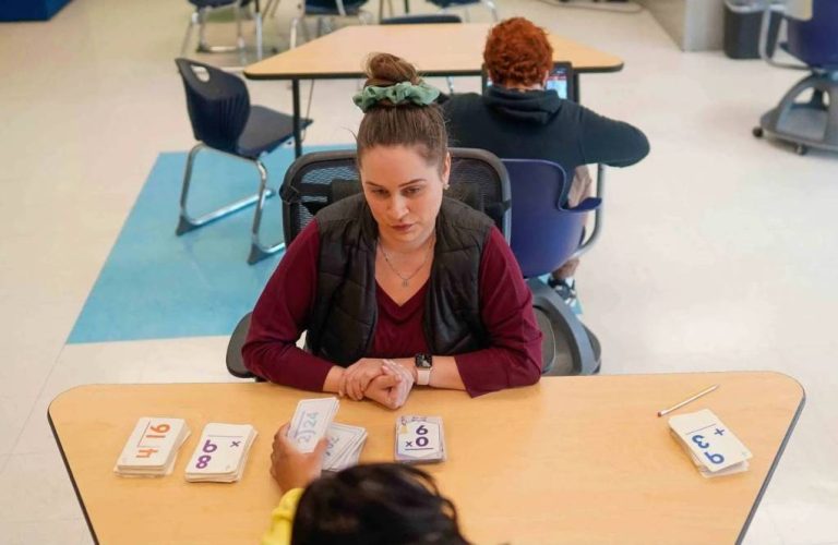
We’ve added a fresh batch of photographs from our community for our rebrand featuring amazing educators and TPT resources. These photos are all designed to be authentic, engaging, and captured within real classroom environments


Graduating to an updated name and logo
Similar to how our original logo shows two teachers forming an apple as they connect over a resource, the two Ts circling one another in this logo are an expression of educators connecting and sharing their expertise. Through our new name and logo, we’re celebrating our history and looking forward to how we’ll grow together in the future.
Looking ahead
Here at TPT, teachers are at the heart of everything we do. As we set out to define the visuals that represent our brand, that guided our creative process. Thank you, teachers, for providing so much inspiration to us on this journey!


